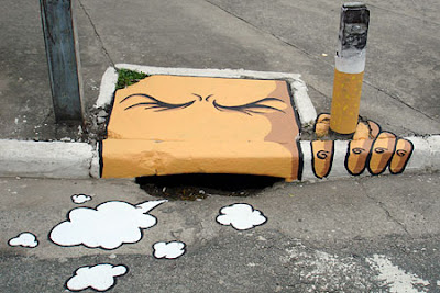
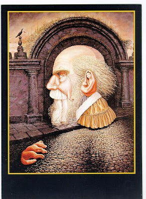
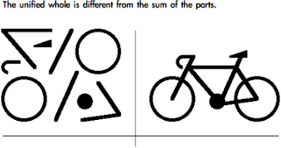
 These three images above illustrate examples of the Gestalt theory.


 These three images above illustrate examples of the Gestalt theory.


ELEMENTS: Background/Foreground
Layering/Overlapping
Line/Shape
Negative Space
COLOR THEORY: Split Complimentary
Complimentary
Monochromatic
Low Key
Middle Key
High Key
Triad
Analogous Colors
Primary Colors
Secondary Colors
Tertiary Colors
MATERIALS: Two 8X10 sheets of mylar or transparency
Acrylic paint/brushes(each of you will be assigned a color to bring)
Thin permanent marker
two 22X30 sheets of Stonehenge
Magazines and books
On the first sheet of mylar trace images out of books or magazines to create a collection of abstract shapes. One way this can be achieved is by connecting partially traced objects together . The point is to not make recognizable objects. Fill your sheet full of lines and shapes.
On the second sheet of mylar you may create an illustration or use representational images. Do not trace an entire page from a magazine or book, make your own composition.
As you collect images think about what objects and shapes will be placed in the foreground and which ones will be partially hidden or may even intertwine with other objects and lines.
Tape off the edges of your 22X30 sheets of paper. Using a color palette of split complimentary colors (ex. red, blue-green, and yellow green) paint the background for each of the mylar images you have traced. The background you paint should not and does not have to correlate exactly. Just be aware that the traced image and the painted image will be merged together. You may paint in a very clean geometric manner or approach it in a more organic, blended manner or other endless ways.
Using a transparent projector, project each traced image onto a separate painted piece of Stonehenge. You may edit your traced lines, meaning you don’t have to trace all of them onto the painted Stonehenge if you feel the composition would be better without them. You may paint the lines or use a sharpie or a white paint pen. Think about whether you want the lines to stand out or blend in with the background.
This last step is to help meld and unify the painted background with the traced linear image. You will do this by painting into the traced image. This is not a paint by number so don’t feel restricted to painting within the lines but it is an option. Remember that cool colors recede and warm colors advance.


